

The problem: confusion at scale and why it matters
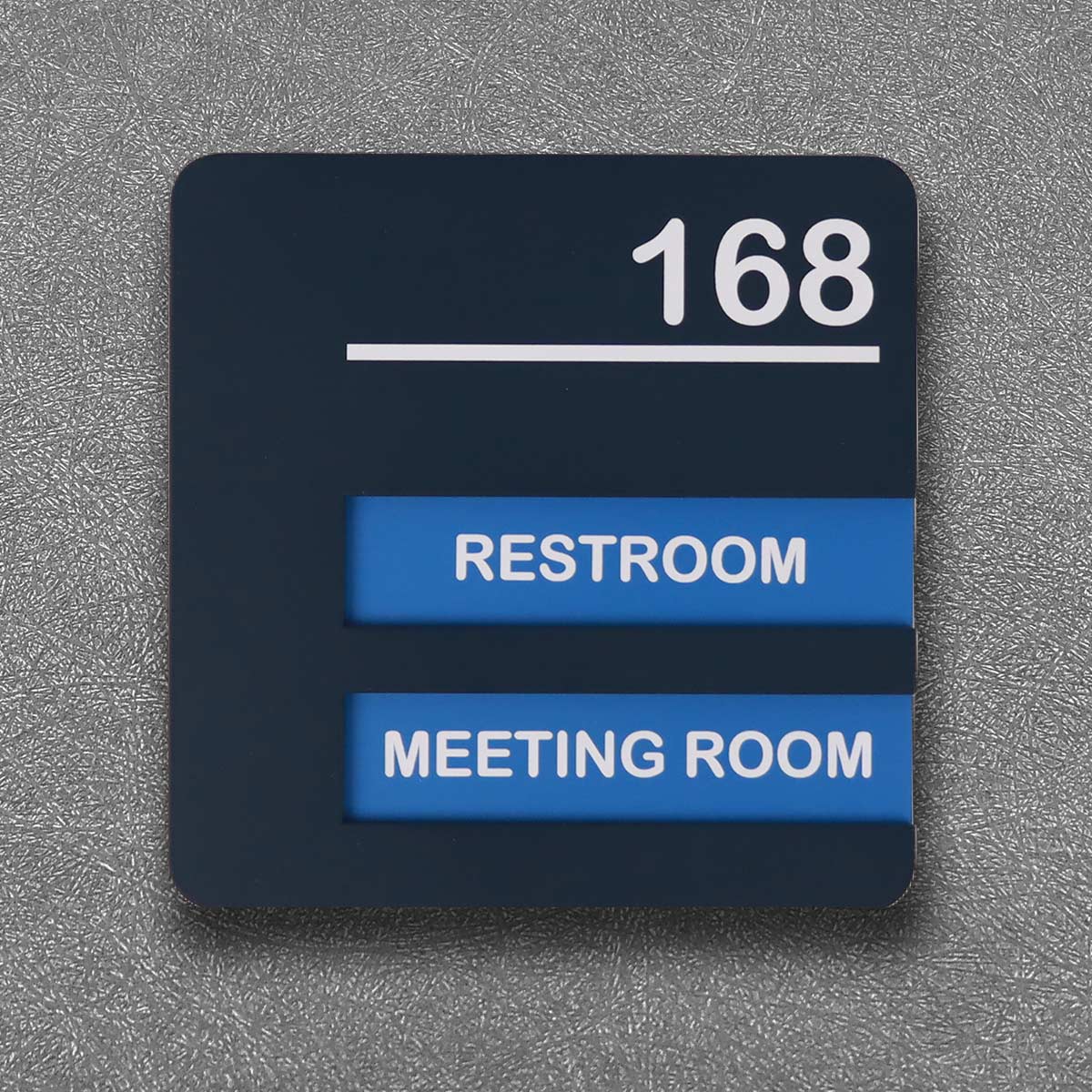
Poor signage creates real operational and accessibility problems in retail, hospitality and healthcare environments. Visitors waste time; staff get interrupted; compliance risks rise. Consider the public-health context — CDC data shows roughly one in four adults live with a disability, so accessible signage is not optional but essential. Early fixes like larger fonts only address part of the problem. Effective strategies combine tactile signage, clear visual contrast and consistent placement so people can follow an intuitive path without asking for help. For those upgrading facilities, looking at ada braille signs and ada braille room number signs first helps align aesthetics with accessibility requirements and everyday usability.
How directional flows evolved: from flat boards to ergonomics
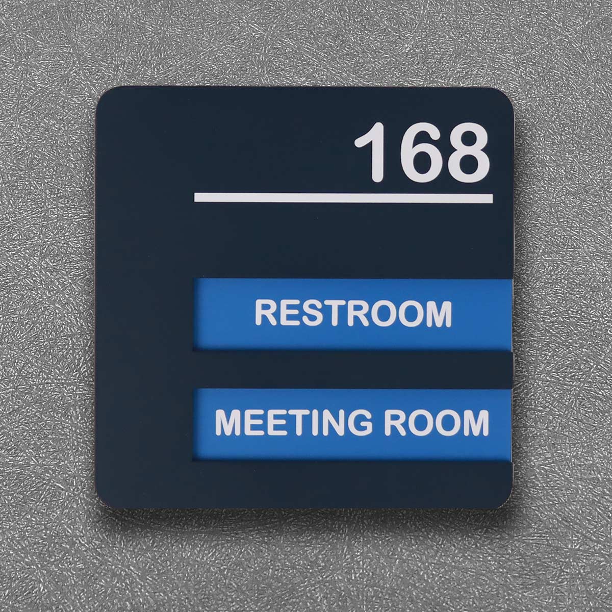
Signage began as flat printed boards. Over time designers introduced pictograms, colours and materials that survive wear. The practical shift was toward ergonomics: mounting heights that suit standing and seated users, tactile characters for touch-readability, and wayfinding sequences that lead people rather than merely point. This is the moment when signage ceased to be decorative and became functional infrastructure—akin to flooring and lighting in its role. Hospitals and hotels that adopted tactile room number plates and high-contrast wayfinding saw fewer misdirections; operations smoothed because visitors could self-navigate with confidence.
Design principles for ergonomic visual directional flows
Three design principles should guide every project. First: hierarchy — establish primary, secondary and tertiary cues so the eye finds the most important information first. Second: multisensory redundancy — combine visual contrast, tactile characters and consistent placement so the message reaches different users. Third: modularity — use custom-moulded plates and interchangeable panels so changes to layouts do not require a full rebrand. Tactile signage must follow standards like the ADA Standards for Accessible Design for mounting heights and Braille formatting; these specifics preserve usability across buildings and over time.
Common implementation mistakes and sensible alternatives
Organisations often make avoidable errors: cluttered sign clusters, inconsistent fonts, and low-mounted signs hidden by furniture. Another frequent mistake is over-reliance on colour alone; contrast and tactile characters are necessary together. A practical alternative is a layered approach — primary directional signs with large pictograms and secondary tactile room number plates for close-range identification. Consider material choices too: anodised aluminium, acrylic with raised characters, or custom-moulded polymer plates each perform differently under heavy touch. Smaller teams may prefer ready-made modular kits; larger campuses benefit from bespoke fabrication and a single manufacturer relationship to retain visual coherence — this reduces retrofit headaches down the line. — A small, precise change in placement often improves flow more than a complete redesign.
How to assess vendors and products: three golden rules
Rule one: verify standards compliance. Confirm Braille formatting, tactile character height and mounting guidelines match ADA/ANSI requirements or your local equivalents. Rule two: test tactile legibility. A prototype should be tried by actual users, including people using canes or wheelchairs; lab measurements matter, but lived feedback saves embarrassment and rework. Rule three: prioritise maintainability. Choose materials and finishes that resist abrasion and cleaning agents; also demand modularity so room number updates do not require full replacements. These three metrics—compliance, usability testing, and lifecycle cost—give objective grounds to compare suppliers.

Closing advisory and value alignment
When selecting signage, weigh measurable outcomes: fewer help-desk interruptions, lower rework costs, and better compliance records. The three golden rules above will help you quantify those outcomes during vendor selection. Ultimately, good signage reduces friction for people and teams on the ground; it is an operational improvement as much as a design one. Cosun Sign naturally fits into that logic as a supplier offering compliant, custom-moulded and modular solutions that bridge branding with accessibility—trusted for projects where both form and function matter. –
